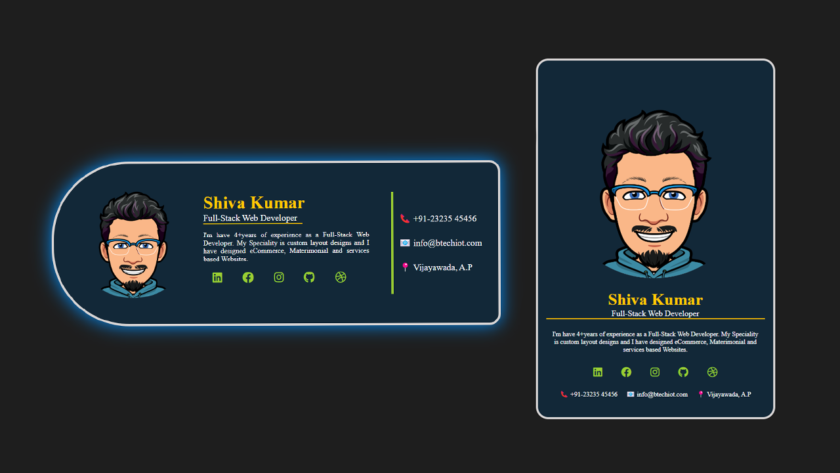
Creating a visually appealing, simple profile card to present your information online. Whether you are a developer, designer, or entrepreneur, having a well-designed profile card can make a big impact. In this tutorial, we will walk through the process of creating a profile card using only HTML and CSS. You’ll learn how to make the design responsive and mobile-friendly, ensuring your profile card looks great on any device.
Learn to create a simple profile card design using HTML and CSS in the video below
Prerequisites
Before starting, make sure you have the below skills:
- Basic knowledge of HTML and CSS.
- A text editor (like VS Code or Sublime Text) for coding.
Profile Card Design, HTML, CSS Code:
Step 1: Set up the Basic HTML Structure
First, we will begin by creating the basic structure of the profile card using HTML. The HTML structure will contain a container for the card, an image for the profile picture, and a set of text elements to display your name, position, description, and contact details.
Here’s the basic HTML code for the profile card:
<!DOCTYPE html>
<html lang="en">

<head>
    <meta charset="UTF-8">
    <meta name="viewport" content="width=device-width, initial-scale=1.0">
    <title>Profile card</title>
    <!-- fontawesome files -->
    <link rel="stylesheet" href="./css/all.min.css">
    <!-- internal CSS -->
    <style>
        /* to make enteir element to center */

        body {
            margin: 0;
            padding: 0;
            height: 100vh;
            display: grid;
            place-items: center;
            background: #1e1e1e;
        }
        /* Add the below CSS code for mobile device */

        /* Add the below CSS code for laptop display */

    </style>
</head>

<body>
    <div class="container">
        <img src="./pic-00.png" alt="">
        <div class="content">
            <h2>Shiva Kumar</h2>
            <p class="position">Full-Stack Web Developer</p>
            <p class="desc">
                I'm have 4+years of experience as a Full-Stack Web Developer. My Speciality is custom layout designs and I have designed eCommerce, Materimonial and services based Websites.
            </p>
            <ul class="icons">
                <li><i class="fa-brands fa-linkedin"></i></li>
                <li><i class="fa-brands fa-facebook"></i></li>
                <li><i class="fa-brands fa-instagram"></i></li>
                <li><i class="fa-brands fa-github"></i></li>
                <li><i class="fa-brands fa-dribbble"></i></li>
            </ul>
        </div>
        <div class="details">
            <ul>
                <li>📞 +91-23235 45456</li>
                <li>📧 info@btechiot.com</li>
                <li>📍 Vijayawada, A.P</li>
            </ul>
        </div>
    </div>
</body>

</html>
Step 2: Styling with CSS
Now for CSS. Let we’ll style the profile card to look professional, using modern web design techniques. Below is the CSS code that styles the profile card for both mobile and desktop screens.
Mobile Design (Responsive)
For mobile devices, we’ll centre the card and make it responsive, ensuring it adjusts perfectly to smaller screens. Here is below the mobile-friendly CSS:
CSS code for mobile responsive design:
img {
            width: 100%;
        }

        .container {
            background-color: rgb(18, 40, 56);
            max-width: 425px;
            border-radius: 1.5rem;
            margin: 1rem;
            padding: 1rem;
            color: white;
            border: 4px solid #d7d4d4;
        }

        h2 {
            font-size: 2rem;
            text-align: center;
            margin: 0;
            color: rgb(255, 200, 0);
        }

        p.position {
            font-size: 1rem;
            margin: 0;
            text-align: center;
        }

        .position {
            border-bottom: 2px solid rgb(255, 191, 0);
        }

        p.desc {
            font-size: 0.8rem;
            text-align: center;
            padding: 10px;
        }

        ul.icons {
            padding: 0;
            text-align: center;
        }

        ul.icons li {
            list-style-type: none;
            display: inline-block;
            color: yellowgreen;
            border-radius: 50%;
            margin: 0 10px;
        }

        ul.icons li:hover,
        .details ul li:hover {
            cursor: pointer;
            border-bottom: 1px solid yellowgreen;
        }

        .fa-brands {
            font-size: 20px;
        }

        ul {
            padding: 0;
            text-align: center;
        }

        ul li {
            list-style-type: none;
            line-height: 1.5rem;
            display: inline-block;
            font-size: 0.8rem;
            padding: 0 0.4rem;
        }
Desktop Design
For larger screens, we want to adjust the layout. This involves making the container wider, positioning the image and text in a row, and adding some hover effects.
CSS code for desktop design:
@media only screen and ( min-width: 550px) {
            .container {
                max-width: 800px;
                display: flex;
                border-radius: 140px 20px 20px 140px;
                align-items: center;
                padding: 20px;
            }
            .container:hover {
                box-shadow: 0 0 32px #028ffb;
            }
            img {
                width: 250px;
                position: relative;
                bottom: 16px;
            }
            .content {
                padding: 20px 40px 20px 0;
                margin: auto 0;
                max-width: 300px;
            }
            .position {
                width: 180px;
            }
            h2,
            p.position,
            ul.icons {
                text-align: left;
            }
            p.desc {
                text-align: justify;
                padding: 0;
            }
            .details {
                margin: auto 0;
                padding: 10px;
                border-left: 4px solid yellowgreen;
            }
            .details>ul>li {
                display: block;
                font-size: 1rem;
                text-align: left;
                padding: 10px 0;
            }
        }
Now that you’ve got the basics of a profile card, you can test it out on different devices. Now you can experiment with different fonts, colours, and layouts to make the design more personal and aligned with your brand or style.
This simple profile card design is an excellent starting point for anyone who wants to display their personal or professional information in an attractive and functional way. By using just HTML and CSS, you can create a responsive, mobile-friendly design that looks great on both small and large screens.
As you continue learning web development, you can explore more advanced CSS techniques, such as animations, gradients, and flexbox layouts, to enhance your profile card design.
If you found this tutorial and blog article helpful and want to explore more web design templates and tutorials, subscribe to our newsletter for more web development tips, tricks, and tutorials.